Our phones are now smart phones and here at Atlas ID we often take existing websites and convert them into smart websites.
There are too many “mobile websites” out there that are really just scaled down versions of a desktop website.
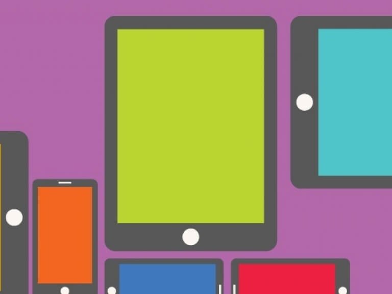
Taking a static website that was designed for purpose of viewing on a desktop and updating it so that it delivers a customized viewing experience for each and every device that is used to access the site.
There are too many “mobile websites” out there that are really just scaled down versions of a desktop website, the idea being a phone is smaller than a desktop and therefore the content should be smaller as well.
Well, they have got it all wrong!
The user interface of a touch enabled mobile device should often be larger and more forgiving than that of a desktop environment. The mouse is a precision pointing device, very accurate. Our fingers and thumbs are not as accurate. Therefore, when creating a user interface for a touch screen it is important to design it in a way that helps the user experience. Bigger target areas for navigation items and links, more negative space around commonly used objects and text and vector graphics for crisp viewing at any resolution. Sometimes smaller actually means that you have to make things bigger.
“It takes a few seconds to write the line of code and a lifetime to understand what it should be.”
If it looks like it’s clickable then it had better be clickable!
Nothing frustrates mobile users more than having to play Battleship with objects on the screen. Can I click on this? …nope. What about this?…nope. I didn’t mean to click on that… (you get the idea). Because 2013 is the tipping point of mobile versus traditional desktop users it is important that your website reflects the user interface needs of this changed demographic. It might be time for a website realignment.
Our team of designers and developers not only leverage the power of adaptive and responsive design but more importantly they understand how to design a user interface that creates a beautiful user experience. Our creative director has a phrase that he often uses, “It takes a few seconds to write the line of code and a lifetime to understand what it should be.” This illustrates the point that separates us from a lot of other web development companies, we have dedicated and experienced user interface and user experience designers crafting solutions that our coding gurus seamlessly weave into every project we take on.
Our design studio environment is very different than most in that our designers and developers work side-by-side. We do not have designers who work on a project and then hand over the designs to a developer to code up, it is not a linear process we follow but a circular problem solving approach to design and development. We firmly believe that this benefits all of our team, the project, the client and most importantly the site visitor.
- Log in to post comments