We all know that people tend to not read web pages, rather they skim or scan them looking for the information they want. This is especially true for landing pages and section pages, users just want to get where they are going. So, it is important that these pages are laid out in such a manner that we help the user to get the information and direction they need when skimming through the page content. Lets take a look at what we can do.
Divide the page into sections of clearly defined related content
You should group related content into clearly defined sections of the page with obvious text labeling or UI elements to inform the user what each section is about.
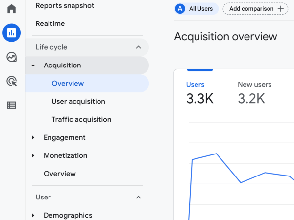
For example, on a news landing page you could group content by category (such as sports, international, finance, etc...) along with the category title in a bolder, larger, and/or contrasting color font. You could also not use a headline and just use an icon if the situation has enough of an established user comfort level to warrant it.
Note: Icons are great but labels provide faster user understanding.
Just having headlines between rows of content to differentiate the sections would help but to more clearly defined related content groups you should lean on the principles of design to be your, and your users, friend.
Principles of design for page layout
- Alignment
- Balance
- Contrast
- Consistency
- Proximity
- White space
Alignment
Alignment gives order to content. Grids have been used for centuries in page layout and with good reason - they help the user to quickly view the content. Good alignment allows the user to scan content quickly, gives a consistent reset point for the eyes, and makes the overall design feel organized.
Balance
A balanced layout again helps users to quickly digest content within a page. User expectations are met when content is where it is expected to be; in balance.
Contrast
Contrast can be achieved primarily in three ways:
- Size - Headlines which are bolder and larger in font are easily picked out by the user scanning through a page.
- Color - Change the font color or background color to make content jump out at the user.
- Design - You can also simply change font to bring attention to a piece of text within a larger text section.
Consistency
Use what works! People expect certain things and it is often a mistake to not deliver on those expectations.
When you see a logo on a page, where do you expect it to be positioned? What do you expect to happen when you click on it?
Things become expectations for a reason - they work.
Proximity
Things that are close together are associated with each other. Things that are far apart have less in common.
You can use the above two statements to guide you when wire framing your content.
White space
White space is your friend! It gives the user frames of reference and also gives their eyes time to rest between content groups. Often you do not need alternating background colors or lines to separate content, just white space. Use white space to help clearly defined the different areas of your page.
In summary
- Users should be able to scan the page and look into the area they want
- Divide the page into sections of clearly defined related content
- Use negative space, proximity, and contrast to create sections
- Log in to post comments