Much is being made about adaptive and responsive web design. It is the talk of the web design community – and rightly so. Here at Thinkbean we have been touting the benefits of adaptive and responsive web solutions for years. We were “adaptive and responsive” when “adaptive and responsive” wasn’t cool! Not only do we believe in these technologies because the superior user experience it offers to an ever-changing set of devices but it is more cost effective than trying to create different solutions for each environment.
When developing a new website you basically have a few options:
- Traditional desktop targeted website
- A desktop website and a separate mobile website
- Fully adaptive and responsive website suitable to every viewing platform
Lets look at each of these options.
Traditional desktop targeted website
The vast majority of websites in existence right now were created with the desktop viewing experience in mind. These sites were optimized for screens that sit on a desk, usually targeted at a screen resolution of 1,024 pixels in width, and navigated with a keyboard and mouse.
These websites look great when you are viewing them on a desktop, laptop or even an iPad in landscape orientation. You can see all of the content in all of its glory as it was intended to be viewed. Oh the happy days of yesteryear!
Times have changed though. Devices are no longer just sitting on a desk and being navigated via keyboard and mouse. In 2013 more people will be accessing the internet via mobile devices than traditional desktop devices.
In this day and age the data tells us people often start research on one device and then carry on in another device.
So what happens when you view one of these non-adaptive and responsive sites on a mobile device?

In the example above you can see the terrible user experience presented when trying to view a traditional website design on a smartphone. Users have to pinch and zoom then drag your content around just so they can make sense of what is one your page and start to digest your content. This is exactly the type of experience that will discourage visitors from browsing your site.
A desktop website and a separate mobile website
Phew; thankfully you can give them a mobile version of your website in addition to your desktop version. For those companies that had the budget, they often chose to do just that – develop a desktop version and a separate mobile version of their website. Everybody is happy right? Well not really – read on.
Having two sites means two different designs, two different development builds, two sets of content, two, two, two, two….it adds up to twice the work! Your web design company is happy because they’re making money. Your users are probably not as happy, though. Your wallet is less happy still.
Lets outline some reasons why:
- Your mobile site was optimized for an iPhone but your user is using a tablet in portrait mode
- You decided to remove some content to streamline the mobile site – valuable information is not accessible to your mobile viewers
- A mobile user emails a link of your site to a colleague but the colleague opens the link on his desktop and is greeted with a tiny mobile site
- Your site gets shared via social media and everyone sees your mobile site even on their super high resolution desktop monitors (looks awful!)
- Your staff has to create and manage two different sets of content
- Bookmarks do not sync as your viewer expects
When creating a mobile version of a website designers, developers and content creators often make presumptuous decisions, such as only showing certain content, removing video or removing primary navigation options. The project is often completed by solving problems only to create other problems.
In this day and age the data tells us people often start research on one device and then carry on in another device. Can you imagine the hassle this would be if you were using a separate desktop and mobile version of a website?
Scenario:
“User whips out his iPhone as he is commuting on the train into work and find a cool product on your company website. Later in the day he open up his desktop and his search history is automatically synced so he can pick up where he left off… the problem is he now sees a tiny 300 pixel wide site on his 2.500 pixel wide desktop display. Your potential customer becomes frustrated and checks your competitors site…”
Lost customer!
At last, the answer is here.
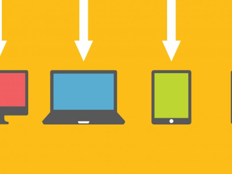
Fully adaptive and responsive website
At last, the answer is here. Your website adapts and responds to whatever device is using it. If they view it on a smartphone it looks superb, on a tablet it looks terrific, on a desktop it looks divine! It gets even better though, if you user rotates the mobile device they are viewing your website on then it will automatically update to show the best possible user experience. One URL to share on social media or view email with anyone on any device. One piece of content to create and manage for any and all devices. One web design and development project.
So what does this look like?
You are looking at it right now! If you are viewing this article on a desktop or laptop then grab the corner of your browser window and shrink the window to see how the content adapts, responds and re-flows to create a custom user experience. If you are viewing this on a mobile device then the content is already optimized for your viewing – no need to pinch and zoom to find something for which you are looking.

Adaptive and responsive website design is how the web should have always been. We all just got caught up on the idea of ”everything must look the same on every device” (No!!!! No it should’t – you shouldn’t have eight horizontally placed navigation links on a smartphone). The web design world inherited a print design workflow. The print design workflow works for print where a page is a page and an inch is an inch. The web does not live in this world – it never has and companies are just now starting to realize and take advantage of this.
To find out more about adaptive and responsive web design and how your company can benefit from it please contact us.
- Log in to post comments